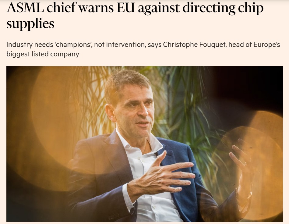
In yesterday’s Financial Times, Christophe Fouquet, the chief executive of Dutch chip equipment maker ASML, explains why it still takes Europe’s most valuable company around four years to build a new factory on its home continent.
It’s not because of weak demand or immature technology. Rather, it’s because of planning restrictions, lengthy permitting processes, and the difficulty of finding and training enough local, skilled staff.
That short passage does a lot of heavy lifting.
Instead of abstract talk about Europe’s “industrial capacity” or “strategic autonomy”, we’re shown what the constraint actually looks like: time, paperwork and a scarcity of skilled people.
This is colour.
And if you’ve been to one of my media or presentation training sessions, you’ll already be familiar with the idea. I use colour as shorthand for the small, vivid details that pull an issue out of the abstract and into the real world. The kind of detail that helps a busy journalist, policymaker or colleague picture what you mean, rather than simply understand it.
If you’re new to the topic, I’ve written about colour before, including why soft evidence matters, how vivid detail makes stories stick, and how journalists use practical examples to orient non‑experts quickly. Those pieces focus on noticing what’s missing when communication feels flat or overly technical.
This piece is for people who are already past that stage.
Below is a table of different ways to use colour. It’s not exhaustive and it’s not a checklist. Think of it as a way of training your antennae to probe for better sources of colour.
Sources of colour for interviews and policy communication
| Type of colour | Vague / abstract version | Colourful version | Why the colour works |
| Observed reality (personal anecdotes) | “We see challenges on the ground.” | “I was outside the clinic at midday, standing in the same queue as everyone else.” | A real place and moment anchors the point. |
| Situational constraint | “Capacity is limited by regulatory processes.” | “It takes about four years to build a factory because of planning rules and permits.” | Time and process make the constraint tangible. |
| Human constraint | “There are local skills shortages in the sector.” | “We have job openings for 20 local hires. Out of 100 applications, only two were qualified” | Shows why this can’t be fixed quickly. |
| Human scale | “Not everyone can be treated.” | “Ten children were waiting in the hot sun. Three got their TB medication. The rest got sent home.” | Small numbers are easier to picture than percentages. |
| Physical action | “Families are affected by access issues.” | “Parents took turns leaving the queue to find water.” | Visible action trumps general impact. |
| Bureaucratic friction | “Administrative fragmentation remains a problem.” | “In one country the paperwork is digital. In another it still has to be faxed in blue ink.” | Mundane detail reveals systemic failure. |
| Named or identifiable people | “Stakeholders have raised concerns.” | “Fred, the local distributor, told me this happens every week.” | Someone real replaces an anonymous group. |
A Brussels‑specific note
These kinds of details map the point at which ambition meets mundane reality: the practical limits of time, skills, systems and space. That’s why journalists look for them early in a story, and why non‑experts immediately understand what’s at stake.
An anecdote without sensory detail is still vague.
A case study that stays conceptual is just another form of management‑consultant abstraction.
For me, it only counts as colour when the language makes the example vivid enough for the audience to picture it. Or, even better, to feel it. And I’m all for that, given that feeling still seems to be something AI hasn’t quite come for.
Yet.